Color Usage
Whether working in print or the web, colors are a tremendous part of the Glacier Hills brand and should be considered with every asset produced. Assuring that the correct colors are consistently used is essential to maintaining regularity throughout the brand. Use the color guides below to maintain correct color usage.
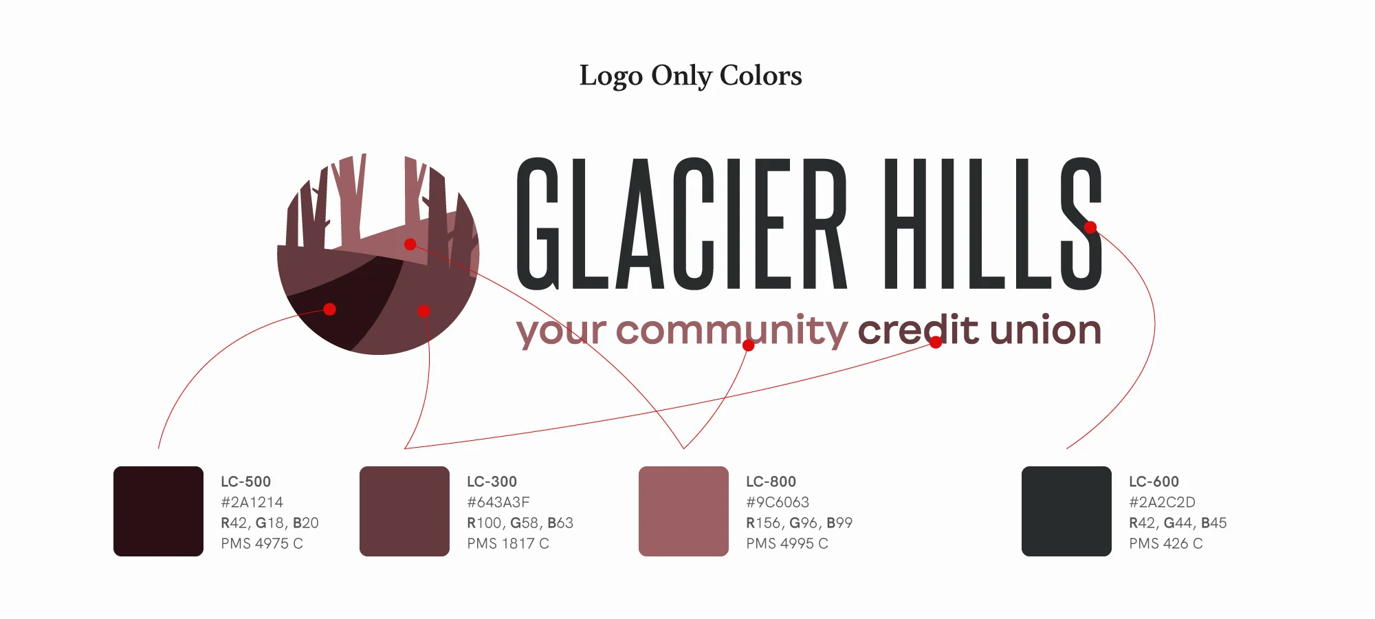
Logo Colors
Although similar, the Glacier Hills Credit Union logo uses slightly different colors than those found in the brand palette. These colors should only be used with the logo in order to maintain consistency.
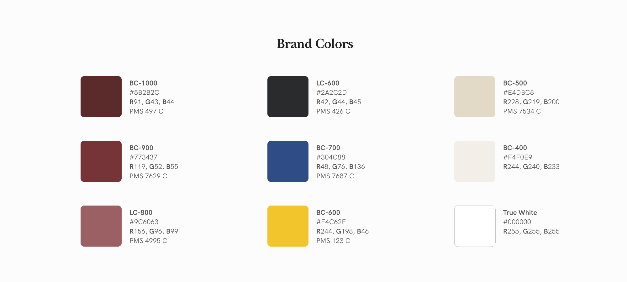
Brand Colors
The primary brand palette is divided into nine colors. Always use the appropriate color code with the appropriate medium you're designing in.


